 bootsgrid
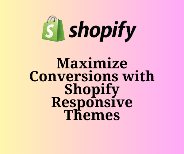
In today’s digital age, having a strong online presence is essential for any e-commerce business. With more people shopping on their smartphones and tablets than ever before, creating a website that looks great and performs well across all devices is crucial. This is where Shopify responsive themes come into play.
Responsive design ensures that your online store adapts perfectly to different screen sizes, offering a smooth and seamless experience for your customers. Whether they’re shopping on a desktop, tablet, or mobile phone, a Shopify responsive theme ensures your site looks great on any device.
In this post, we’ll explore how Shopify responsive themes can help you maximize conversions, enhance user experience, and ultimately grow your business. We’ll also discuss the advantages of premium Shopify templates, the importance of mobile-friendly Shopify themes, and how you can take advantage of Shopify theme customization to create a truly unique shopping experience.
Why Responsive Design Matters for E-Commerce
Responsive design is more than just a trendy buzzword. It’s an essential element of modern web design, especially for e-commerce stores. A Shopify responsive theme automatically adjusts its layout and content based on the device being used—whether that’s a desktop, tablet, or smartphone.
With more shoppers using mobile devices, ensuring your website works seamlessly on all screens is no longer optional—it’s a necessity. In fact, studies show that almost 50% of online shoppers are less likely to make a purchase if the website isn’t mobile-friendly. A responsive theme ensures that your store remains accessible and appealing to customers, regardless of how they access it.
How Shopify Responsive Themes Drive Conversions
When it comes to increasing conversions, the design and functionality of your store are key. Here’s how Shopify responsive themes directly contribute to higher conversion rates:
1. Improved User Experience (UX)
A great user experience is the backbone of a successful e-commerce store. Shopify responsive themes ensure that your site is easy to navigate and visually appealing across devices. Whether your customers are browsing on a laptop or shopping on their phones, they’ll have an intuitive experience that encourages them to explore more and ultimately make a purchase.
Mobile users, in particular, expect fast and easy navigation. A responsive theme ensures that your products are easy to find and your checkout process is smooth—two critical factors for boosting conversions.
2. Faster Load Times
Site speed plays a big role in whether customers stay or leave your site. A Shopify responsive theme is typically optimized for faster loading, which is essential for retaining visitors. Mobile shoppers, in particular, are less tolerant of slow websites. If your site takes too long to load, potential customers may leave before they even see your products.
Responsive themes are built to be lightweight and optimized for speed, ensuring that your site loads quickly across all devices and reducing bounce rates.
3. Higher Search Engine Rankings
Google prioritizes mobile-friendly websites in its search results. So, when you use mobile-friendly Shopify themes, you’re not just providing a better experience for your users; you’re also improving your store’s visibility in search results. Higher rankings lead to more organic traffic, which in turn increases your chances of converting visitors into customers.
4. Consistency Across Devices
When your store looks and functions the same across all devices, customers can shop with confidence. With a Shopify responsive theme, the experience is consistent whether your visitors are using a desktop, tablet, or mobile device. This consistency builds trust with your customers, making them more likely to complete their purchases.
Choosing the Right Shopify Responsive Themes
Selecting the perfect theme for your Shopify store is a crucial step in maximizing conversions. Here’s what to consider when choosing a Shopify responsive theme:
1. Aligning with Your Brand Identity
Your store’s design should reflect your brand’s personality and values. There are many premium Shopify templates available that cater to different styles—from modern and sleek to minimal and elegant. Choose a theme that fits your brand’s aesthetic and resonates with your target audience.
Customization options are key here, too. Make sure the theme allows you to personalize colors, fonts, and images to create a consistent look and feel that aligns with your branding.
2. Feature Set and Functionality
Different themes offer different sets of features. Some come with built-in tools for things like advanced product filtering, product quick views, or blog integration. Others may require third-party apps for these functionalities. Before choosing a theme, assess your store’s needs and select a theme that provides the features necessary for delivering an optimal shopping experience.
Some Shopify templates are more focused on aesthetics, while others may offer more robust functionality. It’s important to balance both to enhance user experience and drive conversions.
3. Mobile Optimization
With the rise of mobile shopping, ensuring that your store is optimized for smartphones is critical. While many Shopify responsive themes are mobile-friendly, it’s worth double-checking that the theme you choose works well on all screen sizes. Features like easy navigation, mobile-friendly buttons, and fast loading times are essential for a smooth mobile experience.
4. Customization Flexibility
One of the great things about Shopify theme customization is that you can tailor your theme to meet your specific business needs. When choosing a theme, make sure it offers customization options that allow you to modify layouts, colors, fonts, and more without requiring coding knowledge. The easier it is to customize, the better you can tailor your store to match your brand and your customers’ preferences.
Customizing Your Shopify Theme for Maximum Conversions
Once you’ve selected the perfect Shopify responsive theme, it’s time to start customizing. Here are a few key areas to focus on for maximizing conversions:
1. Product Pages
Your product pages are the heart of your store. Customizing them to provide rich, detailed information about each product can go a long way in helping customers make buying decisions. Include high-quality images, clear descriptions, product specifications, and customer reviews. The more information you provide, the more likely customers will feel confident in purchasing.
2. Checkout Process
A streamlined checkout process is crucial for conversions. If the checkout process is complicated or too lengthy, customers may abandon their carts. With Shopify theme customization, you can simplify the checkout process by reducing unnecessary steps, offering guest checkout, and providing multiple payment options. A smooth and easy checkout will reduce friction and increase conversion rates.
3. Clear Calls to Action (CTAs)
Effective Shopify theme customization includes optimizing your calls to action. Ensure that buttons like “Add to Cart,” “Buy Now,” and “Checkout” are clearly visible and easy to click on, especially on mobile devices. Your CTAs should be strategically placed throughout the shopping journey to guide customers towards completing their purchase.
4. Adding Trust Elements
Adding trust signals to your theme—such as security badges, customer reviews, and money-back guarantees—can increase consumer confidence. Customers need to feel secure when making online purchases, and trust signals help alleviate any concerns they may have about security or product quality.
Conclusion
To maximize conversions in your Shopify store, choosing the right Shopify responsive themes is essential. These themes ensure that your store provides a seamless and optimized experience across all devices, whether customers are shopping on desktop, tablet, or mobile. By selecting the right theme, customizing it to suit your brand, and optimizing it for mobile users, you create a store that encourages more visitors to convert into paying customers.
A well-designed, mobile-friendly Shopify store can make all the difference in today’s competitive e-commerce landscape. Don’t wait—choose a mobile-friendly Shopify theme that enhances your users’ shopping experience and start seeing the positive impact on your conversion rates today!